13A Portfolio

*DISCLAIMER: For some reason I couldn’t get my fonts to load onto slideshare, so it defaulted to this boring sans serif. If when you’re grading this you could PLEASE tell me how to upload it so I can keep my cool fonts I would be eternally grateful!!

Process: The process for this one was pretty simple because I already had all of the projects created. However I did spend some time refinishing the projects and getting them to look how I wanted. After doing that I uploaded them all into a powerpoint, and added the circles in the background for a design element. My message is that I am a modern and creative designer, and my audience is companies looking to hire me!

Critiques: I received quite a few critiques this week. I received critiques from Sister Larson, who told me to maybe add a little bit more color to my design, and also helped me with some things like the placement of my projects on the slides. Cheryl Meinen also gave some good critique with suggesting that I pull some color out of the projects and insert it into the background of the slides somewhere, which I did! I also had some other great insights from Shelley and Margery.


12A Magazine Spread

The first step I took in creating my Magazine Spread was to draw up some sketches and decide which one I liked the best. After creating the sketches I took my idea to InDesign, and tried to figure out how to make my ideas work. After creating the design I put in the text, and added some design elements, and this is how it turned out!

12AEllieArave2 12AEllieArave3

Font: Title: Impact    Body Copy: Plantagenet Cherokee

Color Scheme: Monochromatic

Critiques: I had a lot of critiques this week, which was great because it helped me out a lot. Most people told me that I should put the text on my second page in 2 columns, which I did. I also was told that the image of the finger was pixelated, so I switched it out for a higher quality image. The last critique I received that I changed was the “Can do hard things!” part of my title. It was originally the same text as my body copy, but I changed it to Impact to match the “You.”

11A Web Page Layout Project

11AEllieArave

11A-Shape Map-EllieArave

Process: I started the process with creating a sketch of my design, then I transferred that sketch into a shape map in Photoshop. After getting the layout I decided what company I wanted to design a website for, and the company that I chose is actually a business run in the Dominican Republic where they own a tree house eco lodge resort. I wanted to choose a color scheme that would fit with the “island” feel, So I chose teal, red, and orange, which is Split Complementary. My message is that there is so much of the world to see, and that people need to get out there and see it. My audience is people who like to travel and see the world.

Critique: I received 2 critiques one from Claire Adney and the other from Steph Dee. Claire suggested that I move my phrase “Adventure is out there..” and the paragraph further down on the page, which I did. And Steph suggested that I move the quote at the top (which was originally in the center) more to the right of the page. I think both of their critiques really made my design look a lot better!

Fonts:  PT Serif Bold and Southern Aire

Links to Images:

9A Photographic Study Project

IMG_7879 IMG_7869 IMG_7876 IMG_7878 IMG_7881IMG_7882 IMG_7875 IMG_7880 EllieArave

Process:

The first thing that I had to do was decide what I wanted to choose as the subject of my photographs. I went with an apple because I felt that there were a lot of interesting things I could do with the photographs. Things like cutting it open, and showing the unique design of the seeds. After choosing my subject I took the photos and created my collage in Photoshop. I didn’t want to do a lot of little photos because I felt like I could better show off the quality of the photos if there were less photos of a larger size. I added the black rectangles and offset them to make the design more interesting.

Critiques: 

I got critiques from Nancy Wells and Ashley Daniels. They both liked the idea of me using an apple, but it was because of their critiques that I cut open the apple horizontally and took photos of the star design. I originally had it cut open vertically, and I feel like them suggesting the horizontal cut made it more artistic.

LFC Photography Activity

Light 2: Inside

Light 2: Inside

Light 1: Outside

Light 1: Outside

Focus 2: Background

Focus 2: Background

Focus 1: Foreground

Focus 1: Foreground

Composition 1: Thirds

Composition 1: Thirds

Composition 2: Lead Room

Composition 2: Lead Room


Photography is definitely something that I am still getting the hang of, but even though I’m not super great at it yet it is something I love to do! These are some photos that I took up at school in the Spring semester. In the first photo the light shining in is from our sliding door/window. In the second one it was a view from my apartment complex. The background and foreground photos I took on campus right next to the Spori building. And the last two photos are of my friend and his dog.

Social Media Marketing Project

Company: Love Yourself

Objective: To get people to pay more attention to what they are eating, and realize the benefits eating healthy brings.

Strategy: To upload this infographic and have people visit the website to see more positive things that can happen with healthy eating. Doing so will increase website traffic.

infographic-page-001 (2)


I created this infographic for a make believe company and website, Love Yourself. I thought putting interesting facts in this infographic and then putting the website at the bottom would increase more traffic to the website. I didn’t just want this to appeal to the healthy eaters, but also to those that are wanting to TRY eating healthy.

Process: I created an account on easel.ly to get started. I made up my company and decided to go with a company promoting healthy eating. I didn’t want just a flat background for my graphic, so I chose some with some design and texture. I put a couple facts about healthy eating on here, but I didn’t want to put too many because I wanted people to go to the website to see more. Although the background is not a flat design, the rest of the infographic is. I think infographics should be simple with not too much details, so that is what I went for. I added the triangles and the dashed line just for some extra design elements.

Critique: Connie critiqued my original design which had larger orange-y triangles at the bottom. She thought they looked like traffic cones. Traffic cones wouldn’t really have been cohesive with my design, so instead I flattened them and made them look less like cones.

Fonts: Title: Impact – Decorative  Body Copy: CA BND Web – Sans Serif


11A Magazine Spread Content

So the Magazine Spread Content project is the first half  of a two-part project. I am creating two pages for a magazine spread, I am writing for the New Era, and my audience is for those getting ready to move on in their life and hit up the college scene. I wrote about my experience as a new college student, addressed some of my worries, and explained how I adjusted to this new phase of life. I am going to post my story, sketch ideas, and images below.

Story: “You Can Do Hard Things”

“I can do hard things.” That’s been my motto for the last three years of my life. Being an adult is awesome, and college is fun, but it is a lot harder than you think it will be. Bills come, friendships fade, and there are times you will feel all alone. I know there were times that I did. But all throughout those times I had a motto. “I can do hard things.”

Most of you might recognize this phrase. It comes from a talk given by Elaine S. Dalton in 2008, and it is called “A Return to Virtue.” This talk got me through the first few adult years, and I know it is something that is going to keep me going throughout the rest of my life.

High school was a piece of cake for me. I was in pep band, orchestra, drumline, advanced ballroom, musicals, and I still managed to graduate with a 3.7 GPA. I was expecting college to be the same, but boy was I wrong. Homework is so much more intense, and I was spending double the time in a classroom. (Hello, ADD) Not only was my coursework more rigorous, but in college you can’t do drumline AND musicals AND orchestra AND pep-band. You have to pick and choose what you want to progress in, and then learn the rest on your own time. That was really hard for me. Here I was in my first semester of school, so over my head. So what did I do? I called my mom! When in doubt, call your mom. It works every time. I told her how overwhelmed I felt, and asked her how one person is supposed to go through all this and manage to succeed in school. This is what she said. “Ellie. You can do hard things. Shake it off, start over, and work harder.” Boy, was that a blow to my pride. I didn’t want to be told I could do it! I wanted to be told I should take a break, quit school, and come back home. But if my mom hadn’t told me those things at that time in my life I think I would have turned out a very different person, and not a person that I liked.

This phrase has got me through the hardest times of my life. I have been rejected twice from dream job, I have dated some real jerks, and been stuck with some pretty crummy roommates. And do you know what gets me through? “I can do hard things.” So when you graduate high school, and your college experience isn’t everything you’ve dreamt of just remember that it’s good to be challenged. It’s good to have trials. You can do it.
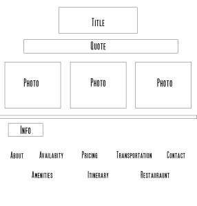
Sketches: 

sketches

Images: 

College student in classroom

College student in classroom

studying

Image Sources:

http://www.mensciencemagazine.com/wp-content/uploads/2012/08/87525778.jpg

6A Slide Design Project

Process:

First thing I had to do was decided what talk I wanted to base my PowerPoint off of. I chose a talk from this last General Conference given by Dieter F. Uchtdorf titled, “It Works Wonderfully!” (linked here: It Works Wonderfully) I chose this talk because it is one that stuck with me, and one that I can personally connect with. I knew that for my theme I wanted my pictures to take up the whole background of my slide, so I started with deciding on pictures. I just went to Google and searched for keywords and selected the “large” image size, and that gave me tons of options. After picking images for the slides I had to come up with where I wanted my text to be located on the picture. Some of the slides were easier to decide on than others, because of the color scheme. After choosing where to put the text I picked my font! We were supposed to use an easy to read, sans serif font, so I chose Franklin Gothic Demi for all the slides except the title slide, in which I used Calibri Light. My message was that the Gospel can work for anybody, as long as you follow those steps I listed. The audience is anybody who is searching for a way to make the Gospel work for them.

Fonts: Title Slide: Calibri Light      Body Slides: Franklin Gothic Demi


Links to Images: 

http://leadtail.com/wp-content/uploads/2014/08/5-Steps-to-Social-Listening-Big-Ear.jpg

http://networkingtimes.com/blog/wp-content/uploads/2016/02/trust.jpg

http://www.amusingfun.com/wp-content/uploads/2013/08/red-love-background-wallpaper.jpg

https://reflectionsintheword.files.wordpress.com/2010/12/footsteps-in-the-sand-2.jpg

http://www.newlife-astoria.com/wp-content/uploads/2015/11/IMG_2315_4.jpg

http://iai.tv/assets/Uploads/stories-of-desire.jpg

Event Ad Project

EllieArave5AScreen Shot 2016-02-04 at 10.52.18 PM

Process: My message was to all those who care about saving our planet, and it was to bring awareness to the beauty of the world around us. I picked sunflowers because they are my favorite flower. My color scheme was analogous with yellow, lime, and green. I wanted my font to be fun because flowers are fun! I combined all the elements, added some shapes,  got some critiques, and voila it was finished.

Critique Process:  My critiquers were Shelley Guthrie Tiffany,  Lacey-Ann Dennis, Judy Daines, and Nancy Wells. The main critique they had for me was that my body copy in the yellow box was not legible. So, instead of keeping it as the decorative font I changed it to match my body copy in the green box.  They also suggested that I put the name of the beneficiary right next to the circle that says who the benefactor is, so I added that as well.

Color Scheme: Analogous- Yellow, Lime, Green

Fonts: 

Title: Sweet Pea (Decorative)

Body Copy: PMingLiuExt8 (Oldstyle)

Link to image:  https://www.google.com/search?q=sunflower+images&espv=2&biw=1045&bih=606&site=webhp&source=lnms&tbm=isch&sa=X&ved=0ahUKEwjk8rOZ9d_KAhUN8mMKHRwMCycQ_AUIBigB#q=sunflower+images&tbm=isch&tbs=isz:l&imgrc=iNluF3Z69NZlYM%3A

Tasteful Typography Project

EllieArave4A-page-001 (1)Screen Shot 2016-01-28 at 7.38.00 PM

Process: To start off I found a photo that I wanted to use on the internet. I already knew that I wanted use a quote and image that had to do with traveling, because that is something that I’m passionate about. My audience was to those who want to go out and see the world. After finding an image I placed it in word, and then found a quote to go along with it. It took me forever to find a font that I wanted to use. In the end I had to settle for the Title font because the one that I wanted wouldn’t download! After getting the font figured out I added the arrows, to add a little bit more to my design. I used arrows because they make me think of traveling and airplanes, so I figured it went really well with the gestalt of my project.

Critique Report: My critiques helped me with what text to use, and also with the placement of it.  After not being able to download the font that I really wanted, I settled for one that I wasn’t 100% happy with. But after receiving critiques I realized I could find a better one. I originally had it aligned on the right, and had to many characters per line, but after being critiqued I made my lines smaller, and aligned my text on the left.

Links to images: https://unsplash.com/photos/eBDdgbM5dSo

Font Name/Category: 

Title: Noteworthy (Decorative)

Body Copy: Cochin (Serif)