Description:
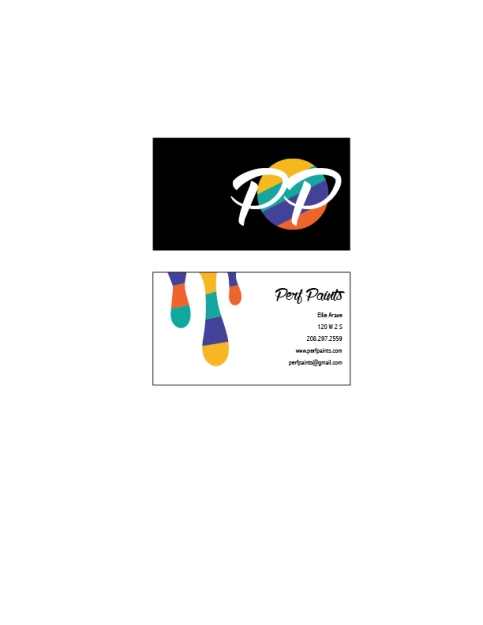
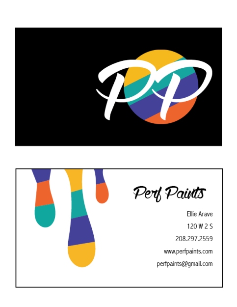
Matching letterhead and business card designed using a personally created logo.
Process (Programs, Tools, Skills):
It took me a long time to decide what business I wanted to design for, but eventually I decided on a paint company. I first sketched out my ideas, then I took them to my tutor, Brent, and he helped me figure out how to lay it out on the computer. I designed the rainbow circle, the paint drips, and the rainbow line in Adobe Illustrator. I then used the Pathfinder tool to split up all the intersecting lines and make them different colors. Then I uploaded them into Adobe InDesign, and put all the text on the Business Cards and the Letterhead.
Message:
My message is that there is a modern, stylish, paint company out there.
Audience:
My audience is anybody looking to paint or renovate their homes in the near future.
Top Thing Learned:
The top thing that I learned this week was that it is okay to be creative, and have a lot of ideas, you just have to be able to harness them to create something that the customer wants.
Color scheme and color names:
My color scheme is Tetradic, and my color names are Teal, Indigo, Gold, and Brick
Title Font Name & Category:
Wolf in the City- Script
Copy Font Name & Category:
Abadi MT Condensed Light- Sans Serif
- Comment
- Reblog
-
Subscribe
Subscribed
Already have a WordPress.com account? Log in now.


Ellie, I think your design is fantastic. The way you incorporated your color scheme into almost everything made it all come together and really aided with unity. I also like the way that you designed your logo. It is simple, yet full of the message. Your business cards are nicely done with the contrast. Overall a very good design. If you want to check out a design that also incorporated a a good color scheme, head on over to https://cbwlax.wordpress.com/2015/06/13/project-6-stationery/
LikeLike
Ellie with the power house design! I really like the way your design comes together for your business card. The way the paint looks like it is dripping down over is sublime. I think the PP goes together nicely, and the colors behind paint the perfect message for what type of company you are. I like the right alignment in your business card, and the spacing helps it seem less cluttered. Well done. Check mine out at https://loganscomm130.wordpress.com/2015/06/14/project-6-staionery/comment-page-1/#comment-12
LikeLike
Hey Ellie!
Great Job! I really love your project, I think it was my favorite! I really love the color scheme you chose, it really works well with your message. I like how you repeated the color elements in both the business card and the letterhead! Overall, awesome job! Keep up the good work!
If you’d like to take a look at my project you can look here:
https://theprincesspat.wordpress.com/2015/06/14/project-6-2/
LikeLike