Project 9: Portfolio

Portfolio (Scribd.com) :

Project Corrections / Time spent:
15 minutes on Event Ad – fixing alignment
20 minutes on Photodesign – inserting the other color swatches, spacing, alignment
20 minutes on Logo – finding new font, spacing
15 minutes on Stationery – spacing, changing fonts and sizing, adding information
45 minutes on Flier – created a whole new flier layout
Total time spent : 1 hour and 55 minutes.
Message:
I wanted to showcase my work in a convenient way. I wanted my portfolio to show off my design style, and my fun personality.
Audience:
Potential Client and Employers
Top Thing Learned:
How to use Master Pages in InDesign.
Future application of Visual Media:
I will look for opportunities to improve the quality of design in both my work place and my personal life.
Color scheme and color names:
Complementary – Teal and Brick
Title Font Name & Category:
Luna – Decorative
Copy Font Name & Category:
ITC New Baskerville Bold – Serif
Thumbnails of Images used:
paisley2

Project 8: Brochure

P8EllieArave

P8EllieArave2

Description:
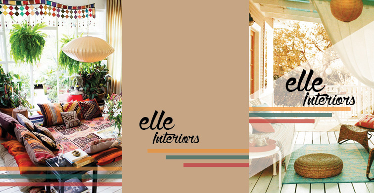
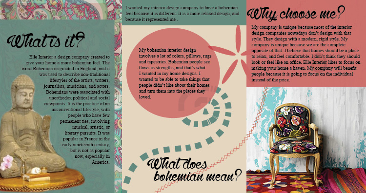
A triple fold brochure.
Process (Programs, Tools, Skills):
I first made a sketch of how I wanted my brochure to fold on paper, then I created the layout in In Design. After creating the layout I chose the images that I wanted and the ones that I felt would best portray my design style. After the images came the logo, I created a very simple logo, because my brochure already had so much going on I didn’t want my logo to detract from my design. The next step was to add all the different colored text boxes and design styles to make it my design my own. And the final step was to create my body copy and my subtitles. After that I just had to fix a few things to perfect the design, and it was finished!
Message:
There is a modern interior design company out there.
Audience:
Those looking to redesign their home
Top Thing Learned:
How to create hierarchy in my design.
Color scheme and color names:
Triadic- red, gold, teal
Title Font Name and Category:
Wolf in the City – Script
Copy Font Name and Category:
Times New Roman – Oldstyle
Word Count of copy:
251
Thumbnails of Images used:
Interior

Interior1

Interior2

Interior5

Interior7

Links to images used:

https://www.google.com/search?site=&tbm=isch&source=hp&biw=880&bih=565&q=country+home+interiors&oq=country+home+interiors&gs_l=img.3..0j0i5i30l7j0i8i30l2.2454.7538.0.7630.22.22.0.0.0.0.89.1444.22.22.0.ekpsrh…0…1.1.64.img..0.22.1438.5YqqZtBqIi4#tbs=imgo:1%2Cisz:l&tbm=isch&q=bohemian+interiors&imgrc=8GGm78WYVBHGBM%3A

Don’t forget to include your video presentation!

Project 7: Web Page Project

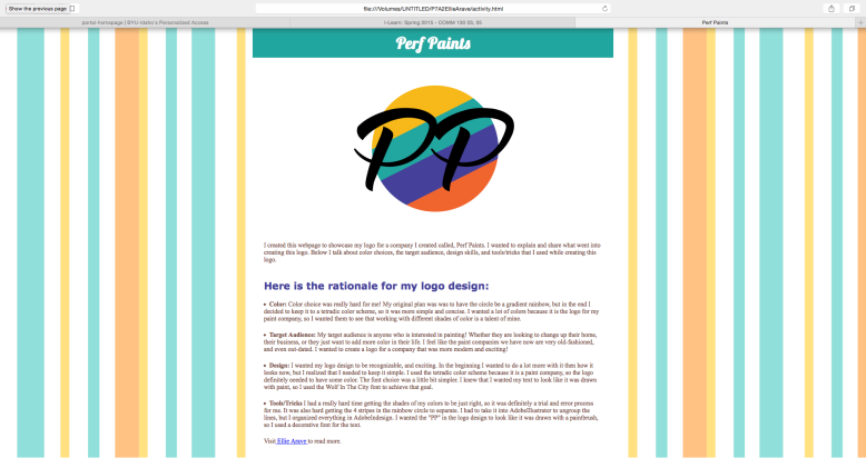
Screen Shot 2015-06-27 at 8.08.23 PM

Description:
This is a web page that I designed for my company, Perf Paints.
Process (Programs, Tools, Skills):
I created this web page using the text wrangler program. It was a 2 week process, with the first week getting all the HTML codes figured out, and the second week getting it to look good using CSS. I put my logo onto my page, and then tried to focus on what I wanted the background to be. I didn’t want to have just a plain background like the example had, plain is boring! So I was lucky enough to find a photo of stripes that matched my color scheme PERFECTLY. Putting the stripes in my web page design was definitely the trickiest part of the process. I put the photo in there, and at first it was the whole background, behind the text and everything. That was too hard to read, so I had to figure out how to put it behind the outside only, and not the body copy. After figuring out I decided that the stripes were too bright. I couldn’t find the way to make them more opaque in text wrangler, so I uploaded the photo in photoshop, and changed them there. After that I changed the link at the bottom to link directly to my blog post, and all you have to do is click on my name!
Message:
My message is that there is a modern, trendy, paint company out there.
Audience:
Anyone who is looking to paint something!
Top Thing Learned:
My top thing that I learned this week was all of the CSS stuff that goes into designing your web page. The html is the base of your web page, but CSS is what makes it appealing.
Color scheme and color hex(s):
Tetradic-Teal, Indigo, Gold, Brick
Title Font Families & Category:
Verdana- Sans Serif
Copy Font Families & Category:
Times New Roman-Oldstyle
Changes made to the CSS:
I changed the fonts, the colors, and the background.
Word Count:
383

Project 6: Stationery

P6EllieArave

P6EllieArave2

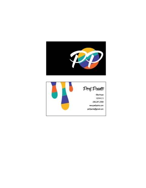
P6BusinessCards

Description:
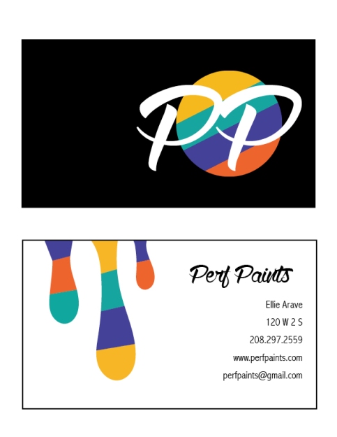
Matching letterhead and business card designed using a personally created logo.
Process (Programs, Tools, Skills):
It took me a long time to decide what business I wanted to design for, but eventually I decided on a paint company. I first sketched out my ideas, then I took them to my tutor, Brent, and he helped me figure out how to lay it out on the computer. I designed the rainbow circle, the paint drips, and the rainbow line in Adobe Illustrator. I then used the Pathfinder tool to split up all the intersecting lines and make them different colors. Then I uploaded them into Adobe InDesign, and put all the text on the Business Cards and the Letterhead.
Message:
My message is that there is a modern, stylish, paint company out there.
Audience:
My audience is anybody looking to paint or renovate their homes in the near future.
Top Thing Learned:
The top thing that I learned this week was that it is okay to be creative, and have a lot of ideas, you just have to be able to harness them to create something that the customer wants.
Color scheme and color names:
My color scheme is Tetradic, and my color names are Teal, Indigo, Gold, and Brick
Title Font Name & Category:
Wolf in the City- Script
Copy Font Name & Category:
Abadi MT Condensed Light- Sans Serif

Project 5: Logos

EllieArave-P5Logos

Description:
Logo for an organization
Process (Programs, Tools, Skills):
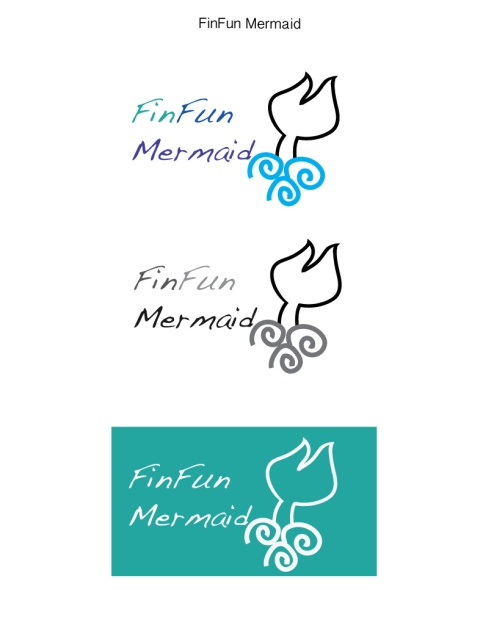
Before even starting to design a logo, I had to decide what company I wanted my logo to represent. Did I want to make a logo for an existing company? Or did I want to make up my own? I decided to create a new logo for an existing company, Fin Fun Mermaid. First I sketched out my 3 different logo ideas in Adobe Illustrator. After making the sketches I got feedback from 10 other people, and 2 draft critiques from the tutor and the lab assistant, I narrowed the logos down to one. After decided I changed the logo a little bit in Adobe Illustrator to make it more cohesive, and then made an example in color, gray-scale, and the last out as a punch-out.
Programs/Tools Used:
Adobe Illustrator
Message:
Mermaid tails are fun!
Audience:
My audience is any person who had the dream of becoming a mermaid.
Top Thing Learned:
By far the top thing that I learned this week was how to work Adobe Illustrator. It is a TOUGH program to get the hold of, but once you start to get the hang of it you can do anything! I look forward to continuing to learn more about the program.
Color Scheme:
Analogous
Color Names:
Teal, Blue, Indigo
Font Category:
Decorative

EllieArave-P4Montage-Christ

Description:
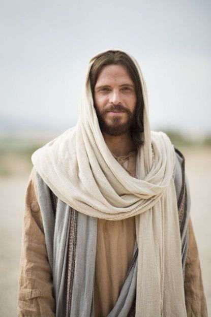
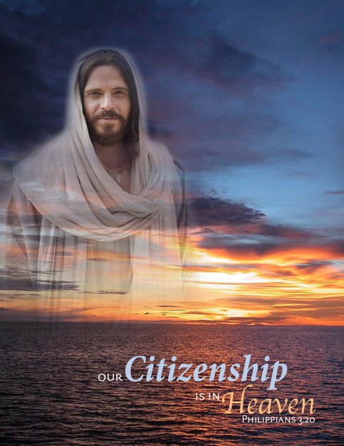
This is a spiritual themed montage I created for my Visual Media class.
Process (Programs, Tools, Skills, Steps taken while designing):
First I picked two photos that were high-quality enough for me to use and print. I then uploaded both photos into Photoshop. The first photo I used as the main photo, and the second one I cropped and put it on top of the first photo. I then put a mask over it, and used the brush tool to make bottom part transparent so it looked like one photo.
Message:
My message is that we all came from the same place, and that is where we all belong.
Audience:
My audience is anyone who believes in Christ.
Top Thing Learned:
I learned a lot more about the Photoshop program in this assignment. I learned how to place photos on top of each other, create masks, and blend lines.
Filter / Colorization used and where it was applied:
I didn’t change any of the colors in the main photo, the one of the ocean and the sky. In the photo of Christ I didn’t change the color, but I used a brush to make him look more transparent and blend into the photo.
Color scheme and color names:
Color scheme – Complementary
Color names – Blue and Orange
Title Font Name & Category:
No title
Copy Font Name & Category:
DTLDocumentaSansTCaps: Sans Serif
AppleChancery: Oldstyle
MinionPro BoldCnIt: Oldstyle

Thumbnails of Images used:
Christphoto

skyphoto3
Sources (Links to images on original websites / with title of site):
http://www.ldsartco.com/blog/the-reality-of-christmas-3f1b2a/

Project 3: Photodesign Project

P3EllieArave

Description:
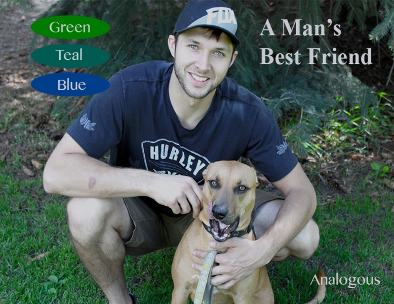
This is a photo I took and edited for my Visual Media class.
Process (Programs, Tools, Skills, FOCUS principles):
First I went outside and took the photo. I then uploaded it into photoshop, and messed with the levels, vibrance, and exposure a little bit. I then added color swatches and the name of my color scheme. I used Caryn Esplin’s color wheel and the eyedropper tool to make the color of the swatches. After doing that I added the phrase, “A Man’s Best Friend” just so I could add a little something more to the photo. I then aligned the text boxes on the right side, and also the ellipses on the left.
Audience:
My audience is all the dog-lovers out there!
Top Thing Learned:
I had never worked in Photoshop or with a camera before, so all the skills I learned this week were important! I would say the top thing I learned was how to work with the camera. I learned how to change the focus of an image, and I know that is a skill I will need to know in the future.
Color scheme and color names:
My color scheme is analogous, and the colors are blue, teal, and green.
Title Font Name & Category:
Times New Roman- Serif
Copy Font Name & Category:
MyanmarMN- Sans Serif
Thumbnail of original, unedited image inserted:
IMG_7306
Date and location you took the photo(s):
I took the photo on May 21st, in Porter Park in Rexburg,Idaho.

Project 3 Activity: Photography

Light 1: Outside

Light 1: Outside

Light 2: Inside

Light 2: Inside

Focus 1: Foreground

Focus 1: Foreground

Focus 2: Background

Focus 2: Background

Composition 2: Lead Room

Composition 2: Lead Room

Composition 1: Thirds

Composition 1: Thirds

This was by far the hardest, but the most fun of all the projects so far! It was hard because I had never used a camera before, so I had no idea how to change the settings. It was fun because even though I had never had to use a camera that I changed the settings on, I have always loved taking pictures! I am so glad I was able to expand my knowledge.

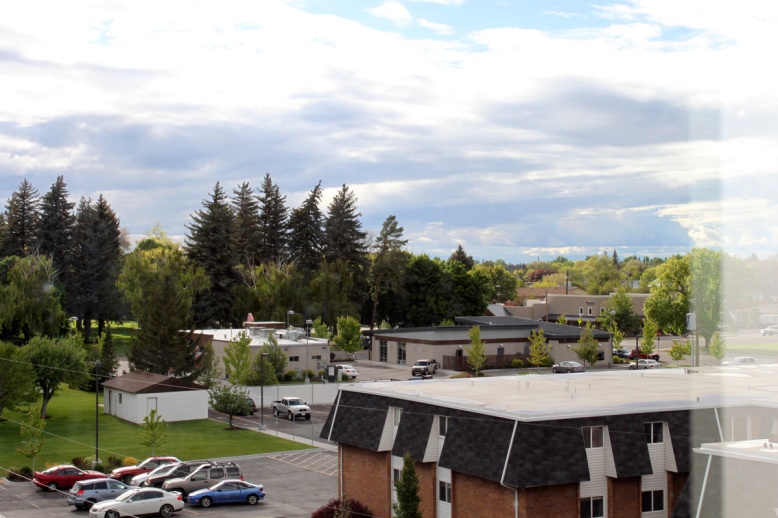
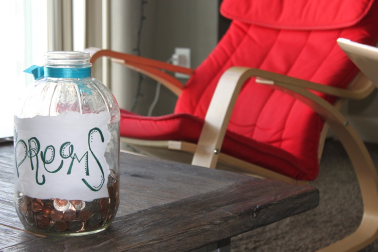
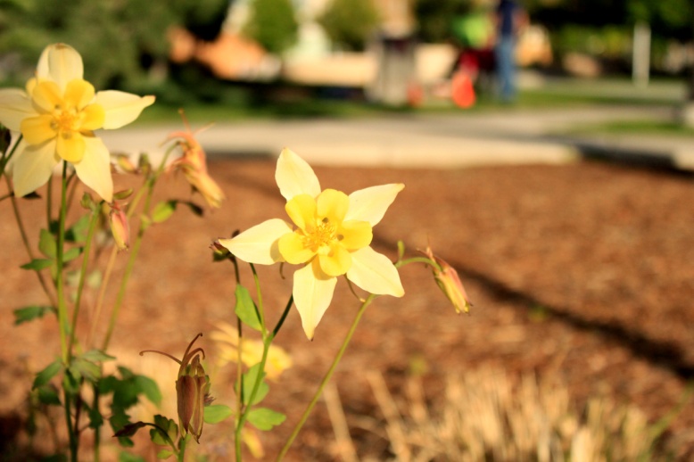
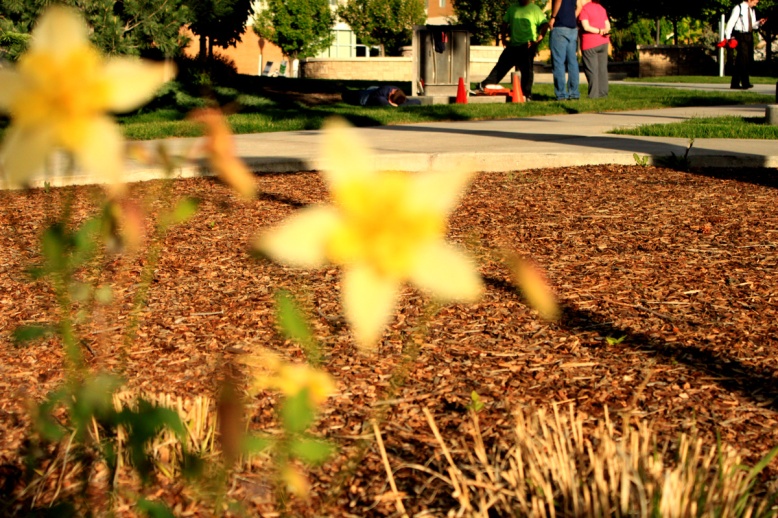
In both the first and second photos I used the Light principles, and tried to focus on the light for these photos. For the first photo I tried to find a time of day in which the lighting would not be too harsh, so I could capture the sky a little better. In the second photo I used the natural lighting, and just set the jar and chair in front of my balcony window. In the third and fourth images I used the Focus principles. In the third photo I learned how to put the foreground in focus, and in the second I learned how to put the background in focus.
In the last two photos I was focusing on the composition, and the position of the subjects in the photos. In the second to last photo I gave my subject a lot of room to look, so the photo didn’t look to be cut off too soon. In the last photo I placed the subject in the far left third, just to shake things up a little bit and make the photo more interesting.

Project 2: Event Ad

P2AEllieArave-page-001 (2)

Description:
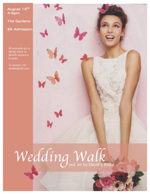
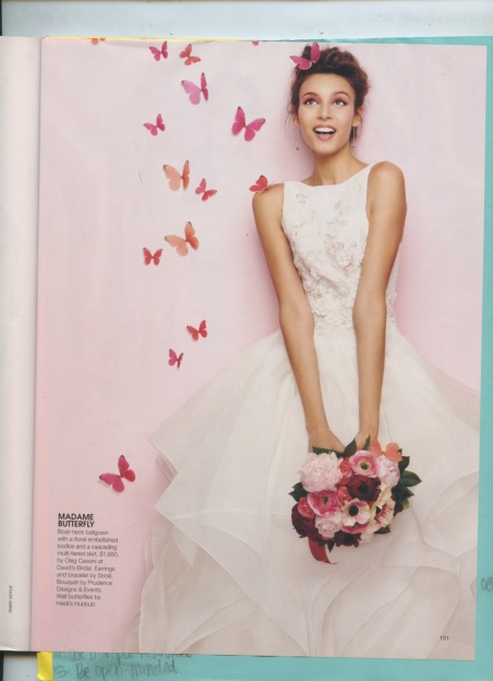
This is a full-bleed color print ad that I made for my Visual Media Class. I used it to promote this Wedding Walk to benefit the women in Ecuador, and I created it using only Microsoft Word and a scanner.
Process:
I scanned this image from a Bridal magazine, and then cropped the edges. I then imported it into Word, and began my design! I made the image take up the whole page because I wanted the design to be full-beed, and then added the Peach colored rectangles to give the ad a higher contrast. I used two fonts because I wanted the title to be a script font, and the body copy to differ from the title. I made one rectangle transparent because I wanted you to still be able to see the flower bouquet at the bottom of the page.
Message:
This fundraiser is to benefit the women in Ecuador. The wedding dresses are going to be sold, and the money from the tickets and the dresses is going to the Dando Amor organization.
Audience:
The audience is anybody in the community who is looking to give back.
Color scheme and color names:
My color scheme is monochromatic, and the color is pink.
Top Thing Learned:
The top thing I learned was how to create something in Word. That will be a huge asset to me in my future career, especially for those clients who don’t have any design programs.
Title Font Name & Category:
Apple Chancer – Script
Copy Font Name & Category:
Thonburi – Sans Serif
Scanned images used, sources, original sizes, location of scanner used:
The image was scanned from a Bridal magazine. The image was originally 8 3/8″ by 10 7/8″. I scanned it at 300 dpi to make it look better when I print it.
Scan

P1EllieArave

Description:
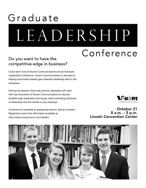
Flier used to promote a graduate leadership conference. Black and white.
Process (Programs, Tools, Skills, FOCUS principles):
I created 4 different sketches that I thought would look good as a layout for the flier. Then I picked my sketch and created it on Adobe InDesign. I used a large black banner and put the word “leadership” inside the box with white lettering to create a high contrast focal point. I also aligned the black banner at the top with my image on the bottom to create some alignment.
Message:
The message I wanted to get across was that the conference was about leadership. It was a conference to help the recent graduates gain “essential leadership skills in the workplace.”
Audience:
My audience is anyone who has just graduated college, and is looking to succeed in their career.
Top Thing Learned:
I learned that each design has a font style that is more appropriate for the design than others.
Title Font Name & Category:
Perpetual Tilting MT – Oldstyle
Copy Font Name & Category:
Avenir – Sans Serif
Links to images used in this project:
1. https://130.commbyui.org/wp-content/uploads/2013/01/VouantLogo1.png
2. https://130.commbyui.org/wp-content/uploads/2013/01/JuliePeterson-Leadership-conference-business-rexburg-Idaho_7530-as-Smart-Object-1.jpg