The first step I took in creating my Magazine Spread was to draw up some sketches and decide which one I liked the best. After creating the sketches I took my idea to InDesign, and tried to figure out how to make my ideas work. After creating the design I put in the text, and added some design elements, and this is how it turned out!
Font: Title: Impact Body Copy: Plantagenet Cherokee
Color Scheme: Monochromatic
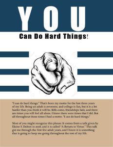
Critiques: I had a lot of critiques this week, which was great because it helped me out a lot. Most people told me that I should put the text on my second page in 2 columns, which I did. I also was told that the image of the finger was pixelated, so I switched it out for a higher quality image. The last critique I received that I changed was the “Can do hard things!” part of my title. It was originally the same text as my body copy, but I changed it to Impact to match the “You.”
